Version 3.8 of WordPress, named “Parker” in honour of Charlie Parker, bebop innovator, is released. Let’s have a look what’s new.
Introducing a modern new design
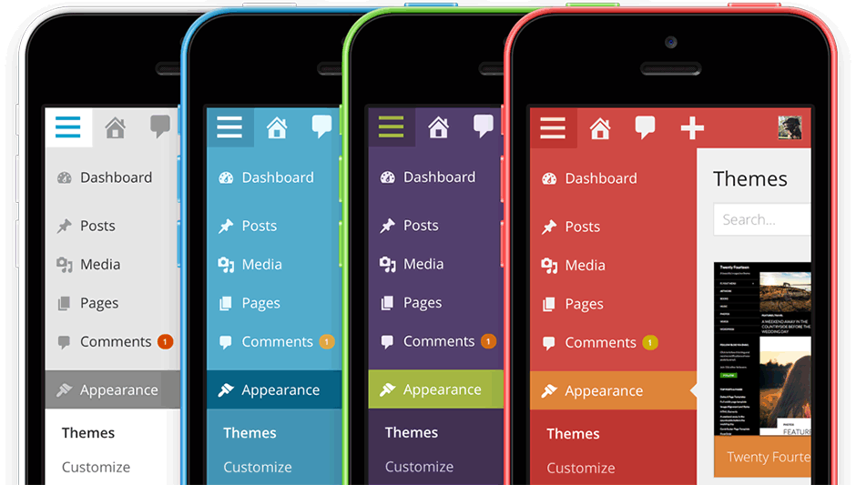
The WordPress back-end has gotten a full facelift. 3.8 brings a fresh new look to the entire admin dashboard. Gone are gradients and dozens of shades of grey. Bring on a bigger, bolder, more colourful design!

Modern aesthetic
The new WordPress dashboard has a fresh, uncluttered design that embraces clarity and simplicity. A modern flat design is used throughout.
Clean typography

On the font side, the Arial font has been swapped for the clean Open Sans font which has more space between the letters (looser kerning) for increased readability. The Open Sans typeface provides simple, friendly text that is optimized for both desktop and mobile viewing.
Just as important, to ensure crisp, sharp icons – regardless of screen resolution – and fast-loading webfont icons (Dashicon font) are used, replacing the image-based icons.
Refined contrast
With superior contrast and large, comfortable type, the new design is easy to read and to navigate.
WordPress on every device
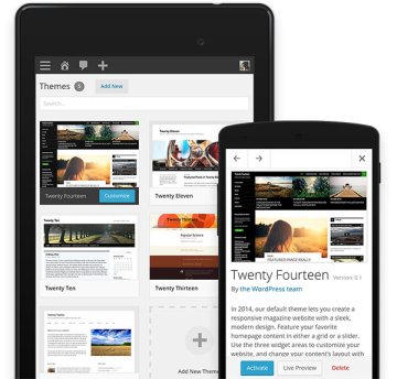
It’s responsive and the smartphone/tablet view is far more usable than before. Smartphone, tablet, notebook, desktop — no matter what you use, WordPress will adapt.
Admin colour schemes
And if you don’t like the default charcoal-and-blue admin colour scheme, you now have seven other versions to choose from: Default, Light, Blue, Coffee, Ectoplasm, Midnight, Ocean, and Sunrise. pick the one that suits you best.

Colour schemes can be previewed and changed from your Profile page.
Refined theme management
The new Theme Manager has been reworked with the same minimalist approach. Theme info is moved to modal windows allowing for a quicker overview of available themes and a more in-depth inspection of theme info.

Smoother widget experience
Widget management can be complicated. The new Widgets interface is much more streamlined. On large monitors, multiple widget areas stack side-by-side to use the available space while on tablets, just tap on an available widget and select what widgetized (sidebar) area that widget should appear in.
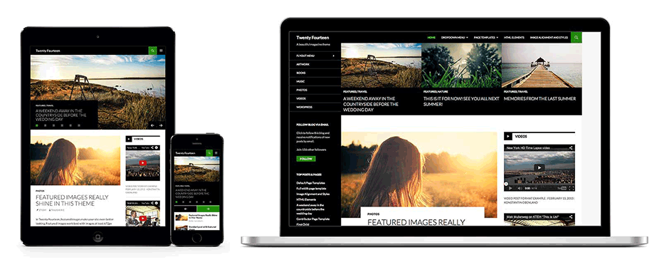
Twenty Fourteen, a sleek new default magazine theme
Create a magazine-style site with the new Twenty Fourteen default theme. Choose a grid or a slider to display featured content on your homepage. Customize your site with three widget areas or change your layout with two page templates.

What’s next?
WordPress 3.7 was released in October 2013 and 3.87 in December 2013. The company is pushing a faster release as of late, and so we expect to see WordPress 3.9 in February.
