With the changing landscape of technology people now use all kinds of devices to access the internet – desktop computers, laptops, tablets and phones. User expectations have changed too and people browsing the web nowadays want to have full functionality from a website whether they’re accessing it from their phone or their computer. This is where responsive web design comes in.
What is a Responsive Website?
A responsive website will be easy to read and navigate when you look at it on different devices:
- Desktop
- Laptop
- Tablet
- Smart Phone
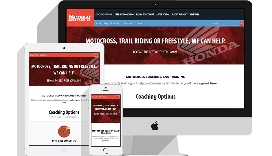
The content is still the same but it has been automatically resized and/or repositioned to increase usability and enhance the visitor experience. The website is simply adapting automatically to the device.
To see this live in action slowly resize your desktop browser and see the layout of this article magically adjust itself to fit the new width of your browser.
Why is this such a big deal?
Not long ago, we designed websites typically for laptop and desktop screens. These were mostly designed at a fixed width between the 960 and 1200 pixels. This worked fine until the arrival of smart phones and tablets.
When these ‘fixed width’ websites were viewed on a desktop computer the website might show three columns but when viewed on a tablet or phone you would be forced to scroll horizontally or zoom in order to read the text. This is definitely not user-friendly and on top of that, these websites can be slow to load because they are not optimised for use on mobile devices.
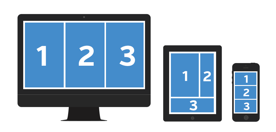
With responsive website design a three column desktop design will automatically reshuffle to two columns for a tablet and a single column for a smartphone making it perfectly readable and easy to navigate on all devices.
The other reason responsive website design is such a big deal is that from April 2015 Google will give ranking preference to responsive sites so if you’re not up with the latest in website design, you could very well be doing your business a disservice.
The bottom line
Today more and more people are browsing websites from mobile devices so it’s even more important to provide them with a consistent website experience no matter what device they are using.
With a responsive website design you know your website will be an effective marketing tool for years to come.
These days web design and responsive web design
are the same thing.
At Good Websites, we use responsive web design for all our WordPress website projects and One Page Websites. This way we provide our clients with the latest technology and ensure that each site we launch uses Google’s recommended method of creating mobile-friendly websites.
If you need more reasons why you should switch to responsive web design, check out our 6 Reasons Why You Should Switch to a Responsive Website Now.
As always leave any questions you have in the comments below.
We are more than happy to answer them.
By leaving a comment you agree with the storage and handling of your data by this website. You can learn more about how we handle you comment information in our Privacy Policy. We are using Akismet to reduce comment spam. Learn how they process your comment data.